Design Thinking for Devs
What is it, and why should you care?

In my previous article I talked about why developers should be in design sprints, and it’s been nice to hear that there are devs out there who agree with me. The one question that keeps cropping up though, is: “What exactly is a design sprint”?
So trying to keep it to simple words and nothing too ‘design-y’, here is a brief introduction to design thinking.
First things first, what the f**k is it?
The best answer I have found is: “Tackling ill-defined problems in a human-centric way” — You put yourself in your user’s shoes
It’s a process made up of 5 stages. To begin with, you move through them, working towards a solution to your problem.
- Empathise
- Define
- Ideate
- Prototype
- Test
Which is all well and good, but what does that actually mean? Let’s take an example. First of all we get our ill-defined problem.
“Our new webshop isn’t getting as many sales as we thought it would”
Empathise
With that problem as clear as mud, we can move onto the first stage in the design sprint, Empathise
Understand from a user’s perspective what it’s like to use the site. Try it yourself, run user testing, benchmark against industry leaders. Basically, use it, poke and prod at it, listen to what people are saying.
So let’s take a look at our example site (with all due apologies to arngren.net):

Define
The horror, the horror! Right? But now we’ve tested the site, we’ve got some feedback and we’ve interviewed some actual users. So now we can move on to Define. What exactly is the problem that we’re solving? Why are they not converting site visits to sales?
Let’s look at some real(ish) feedback:
- It should be set on fire and s**t into space! (dev)
- Poor use of white space, there’s no flow (UX)
- It’s takes, like, a minute to load! (dev)
- The Accessibility is all wrong (UX)
- Are those bugs or features? (dev)
- The baseline isn’t good (UX)
- I think it’s fun, but I don’t trust the checkout (actual user)
These are some pretty typical bits of feedback and you can see the different perspectives coming through (which is why you really should have a mixed team in a sprint). But let’s address that last bit of feedback from an normal user of the site:
“I think it’s fun, but I don’t trust the checkout”
That comment cuts through our ‘expert’ diagnosis and actually gives us a nice piece of insight. I think we can safely say we’ve defined our problem — Users actually like the site, but they have no confidence in the checkout.
Ideation
With a clear problem to solve “Users don’t trust the checkout”, we can move on to Ideation. This is the bit where we get all clever and stuff, and come up with ways to fix the problem.
Now there are two important things to remember here:
- There are a ridiculous number of techniques people use for ideation, but they are nothing to be scared off. A good workshop facilitator will only use them to help unstick the nuggets of genius up there in your head.
- THERE IS NO SUCH THING AS A BAD IDEA. This is important. At this stage, just throw up everything. You’d be surprised how many times a truly batshit idea spawns some real brilliance.
So bearing these two things in mind, we’ll have dived into extracting all that brilliance and will have produced a veritable flood of post-its. They’ll be all over the walls, like technicolour unicorn vomit. This is the scene that people seem to always conjure when they picture ‘creativity’. In truth, it’s just a convenient way to get those ideas out and up in a people-readable way.
Now we have our ideas, we have to choose the best ones to go forward with. Again there are a number of ways of doing this, from rock-paper-scissors (seriously), to all kinds of sticky dot related voting malarky.
The important thing is that we choose something and proceed to the next stage.
Prototyping
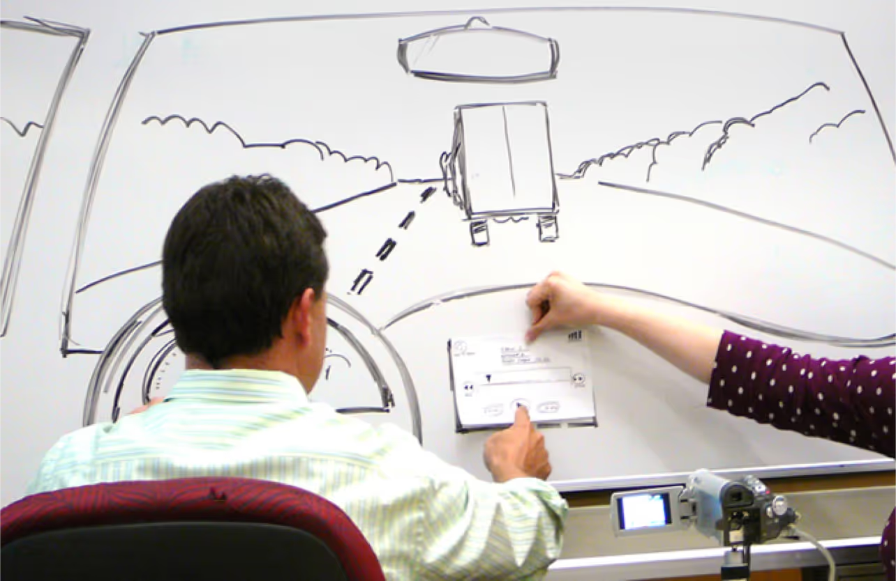
As a dev your first instinct is to break out the boilerplate and start building some kind of MVP. Cool your jets, hotshot! Go as low tech as you can to start with, nothing wrong with good old pen and paper if it does the job. The designers may be rushing off to Invision or Flinto if they want something a little more substantial, but if you’re just testing the concept and not the UI, quick and dirty is the way forwards.

NB: Whilst this can be a nice opportunity to put your feet up with a cuppa and let your ultra-hip design colleagues do the work, it is worth at least sticking around for the beginning and making sure they understand exactly what you meant about the tech on that hastily scribbled post-it.
Once the prototype has been cobbled together, it’s time to put it in front of some unsuspecting innocents.
Testing
Simply, grab some users. Make them use your prototype. Designers have ways of making them talk.
Seriously, they do. There are even dedicated UX Researchers out there who get worryingly phycological at people.
The aim of this testing is to get insights, which basically translates to: “do people like our idea?”
From this there are only really two ways to go:
It’s a success. Now it’s time to fire up your tools, atomic batteries to power, turbines to speed and get building.
Or, more likely…
It’s back to the drawing board — You see, this is the thing with design thinking, it’s not really a step-by-step recipe, it’s more of a set of modes in an iterative process.
You’ve taken a good stab at solving the problem. Maybe the users didn’t like your solution, maybe they didn’t agree with your definition of the problem, but at least now you have a better idea of where to look and you didn’t waste a load of resources to get there.
Quick testing and validation lead to great solutions with minimal overhead and a better chance of success.
As my team puts it: “Be fast to fail”
Personally, I like to think of it as: “Failing with style”
More stories


